Packaging Materials | The Business of Packaging | Packaging Design | Food Packaging | Packaging Psychology
Gaining market share in any one of the consumer goods and fast-moving consumer goods markets takes serious effort for marketing departments and packaging engineers. Catching the attention of your target market over competition on the shelves or on the web is challenging, and its also very important! Brands with heavy competition may need to try something out of the ordinary, or outside of the box to get noticed.
We capped 2016 with our first annual list of unordinary packaging, so it would only be right to continue a new tradition. Let's take a look at the wilder side of packaging design in 2017 to close a great year!
1. Body-Positive Bottles
Dove made some unintended waves in the U.K. earlier this year with an unfavorable reception to the bottling redesign for their popular line of body washes. To follow along their long-running campaign, "Real Beauty", the design agency that Dove worked with re-imagined the body wash bottles in various sizes and shapes with curves that vaguely resembled the female figure. The new packaging was largely shunned on social media and in news publications for objectifying women.
https://www.youtube.com/watch?time_continue=4&v=CRiv2lgaX_U
However, the Dove brand has a long history, 15 years running, of very successful, well-planned and well received campaigns for promoting beauty confidence in women. They'll surely keep the consumer response to this package re-design flop in mind in 2018.
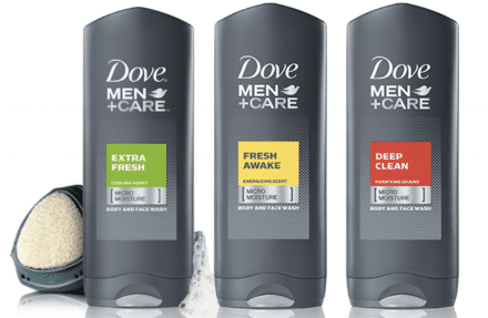
On a lighter note for the Dove brand, they're men's collection of cleansing body washes have been largely popular and well-targeted. The masculine, dark gray color with bright labeling and sleek, angular-yet-smooth bottle look great and do not play on anything taboo.
Job well done.
2. Identical Twist
The popular laundry bleach and dish detergent brand Sun Products created an easily mistakable twin package for their two very different products. A post on Reddit confirmed the similarities in packaging and the evidence is clear; these two products looked too much alike! Their powdered versions of bleach and dish-washing detergent were packaged in an almost identical yellow box with similar graphics. To add a little extra confusion, both products have the same scent.
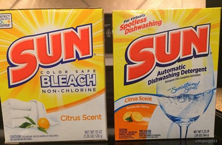
The author of the post confirmed that they themselves used the wrong powder while completing their dish-washing duties. Here are a couple takeaways:
- Be sure to check the labels on your products before you use them!
- If you are designing the packaging for multiple products, opt for a clear and obvious differentiation in each design! Make the products easily distinguishable by either color, shape or graphic. You will save your end-users from potential mix ups!
3. Faking Food
Another UK-based brand was raked over the coals last month on social media after a user posted an image of their packaging and its deceptive design. Waitrose, a large supermarket chain across the UK utilizes an open-ended carton to package their wraps. Two thirds of the top of the carton were removed in the design to provide visibility to the contents.
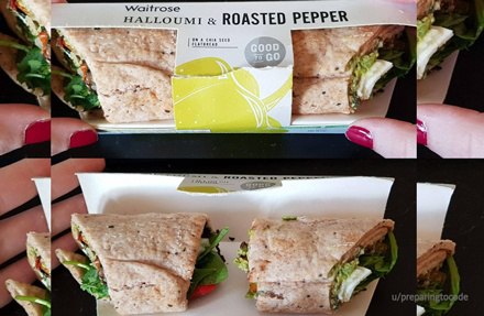
The problem here is that the wrap was cut in half and intentionally placed facing outwards. By hiding the actual ends of the wrap underneath the middle portion of the carton, it made the 2 pieces appear as 1 and about one third larger than they really are!
Is this a cheap move at cutting costs for quantity? Or is it an accidental cut at the quality of the customer experience, leading to a negative perception and a loss in repeat customers?
Be careful for the customer experience when you review your designs and plans for being an honest brand. I would consider this making the list of packaging fails this year.
4. Sweet Unboxing Experience
The True Honey Co. out of New Zealand worked with creative packaging design agency Marx Design, Ltd to bring a truly incredible unpackaging experience to the market with their honey.
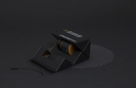
The simplistic outer shell is deceiving in all the right ways, and as you open the box its intricate yet simple design is completely satisfying. Each corner fits together perfectly and forms snugly around the clean and simple jar within. This very unique, aesthetically-pleasing package even won the structural packaging design award at the Best Design Awards held by the Designers Institute of New Zealand!
Kudo's for creating an unboxing experience that truly stands out amongst the competition!
5. Warning: Check Your Labels!
This one isn't about the visual appeal of the packaged product, but it's meant to serve as a reminder to always check, double-check, and triple-check your product labeling before going to production! An unknown manufacturer of screwdriver sets somehow managed to add a very unusual warning graphic on their product labeling.
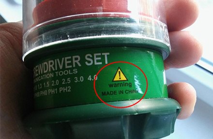
With no other sign of what the end-user may need to be cautious of, the warning symbol is placed right above a line reading "Made in China". There were unfortunately no other signs of what the warning was actually meant for, but this was a pretty glaring miss on their design team! Check your labels!
6. Re-branding with the MarketTrends
It's important to be aware of your target markets interests and needs. The well-known Greek yogurt brand, Chobani, took notice of consumer trends and the steadily increasing lean towards more natural and healthy products and incorporated it into their re-branding strategy this year. Being only 12 years old, they took their fresh clean and simplistic yogurt cup and overhauled it with a more traditional look. This is a big change compared to their bright and crisp designs that have been copied heavily over the years. Chobani wants differentiation on the shelf, and to promote their wellness-focused brand.
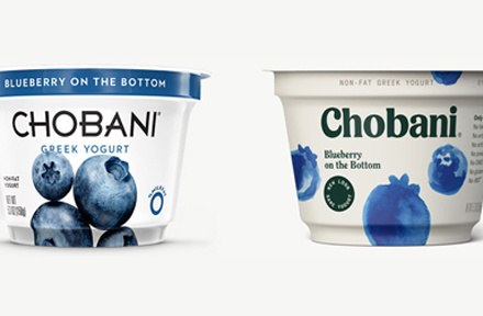
The packaging overhaul was a fairly popular discussion Reddit where there were mixed reviews with strong backings for both sides. Many appreciate the organic feel of the new design and the softer, more family-oriented font used. They removed the images of real fruit and opted for a simplistic water-color graphic of the fruits inside each yogurt flavor.
If your brand hasn't paid attention to your products' consumer needs, take Chobani as an example of how to re-brand strategically.
There are many more that could have made the 2017 list of unordinary packaging, but these are the ones we felt were worth giving a nod to at year-end. Did you come across any packaging designs this year that made you stop and say, "what.."? Share them in the comments below!