


Color psychology plays a big role in advertising and retail sales. Package color has a notable effect on consumers and can turn them on to your product or chase them away. Depending on the demographics of your target market, the colors you choose to employ on you packaging materials can make or break the success of a product.
While color psychology is not exactly magic, it can have an almost metaphysical effect on your customer base. Choosing the right colors to invoke the right emotions is a tightrope act that when done correctly, can produce amazing results. But which colors are right for your packaging?
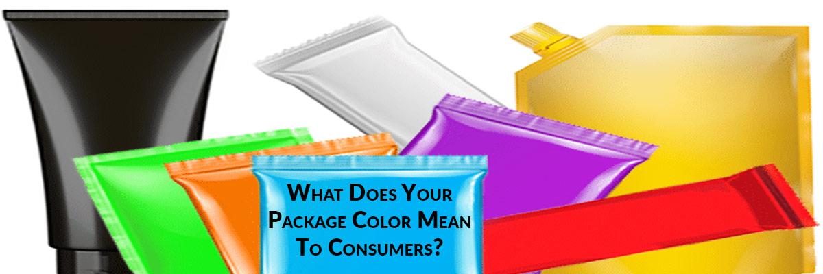
Color Choice For Consumer Packaging Can Make Or Break A Sale..
How big of a factor does color selection play in your package design process? From a consumer's perspective, the color of your packaging can greatly, or gravely, impact the decision to purchase your product over your competitors. Buyer demographics like age, culture, gender identity, and global location should all play a part in selecting the colors that will represent your product on the shelf, or on the web.
To say that there is a kind of sorcery and certainly a science to the psychological power of colors... well, that would be a great understatement.
From colorpsychology.org:
"When we visit a museum to appreciate a work of art, we take it in through the colors we see because they invoke within us certain emotions, making the claim that everyone sees it differently a reality. Interior decorators survey the effect of colors when deciding what color (Or rather color associations) the walls of a certain area in a building will be painted.
The reason that many offices have a lot of greys, blues and browns incorporated in their décor is because these colors tends to increase productivity. Yet, this is not a rule of the thumb. This does hold true for a corporate environment, but if one were to work say for example in the fashion industry, or the media, the use of brighter and more “colorful” paints would help encourage creativity.
Many car commercials show black as their model, because this certain color is associated with affluence and seriousness. This leads the consumer to believe that the product is worth buying. Even the food and drink industry uses color to attract more people to certain brands. The purple and gold packaging of a certain brand of candy bar is a technique to lure the consumer into believing that this is chocolate royalty, and why would one not want to buy the best of best. Culturally speaking, colors have different values attached to them too. A bride in the western world wears white, where as it is what a widow wears in South Asia."
What different colors mean to your brand identity on the shelf:
Black:
Black represents authority and luxury...

Using black as a main color in your packaging exudes a top-tier product identity. It also represents elegance. Globally, black exemplifies a wide range of emotions.. from trust, to evil, and also mourning. Selecting different colored packaging for different locations may be worth considering when selling globally. Align color selection with your product and its intended retail geography.
- May evoke power, elegance, formality, death, evil, and mystery.
- May invoke fear and the unknown (black holes).
- Sometimes manifests negative connotations.
- Suggest strength and/or authority.
- Considered a symbol of grief by many.
White:
White represents cleanliness, purity, and simplicity...

White packaging exudes simplicity in your product. The clean and pure color (or lack there-of) allows for clear and concise messaging, and exudes peace and calmness. White can also induce thoughts of creativity, likened to a white canvas with endless possibility.
- May evoke light, goodness, innocence, purity, and virginity.
- Signifies perfection.
- Manifests feelings of safety, purity, and cleanliness.
- Generally invokes a positive connotation.
- Often used to represent faith and purity.
Are You Using The Right Shrink Film For Your Production Line? Get The Cheat-sheet To Find Out!

Red:
Red represents passion and boldness (and appetite)...

Red packaging is bold, and is a great color to use to grab attention. Additionally, red gets the metabolism going! This is good for foods, as a moving metabolism creates an increased appetite. Red can also create feelings of excitement and passion.
- May evoke energy, war, strength, power, determination, passion, desire, and love.
- May increases respiration rate, raises blood pressure in most individuals.
- Often represents a warning of danger.
Orange:
Orange represents fun and low-cost...

Orange is the color of fun! Several studies have found that orange, yellow and brown are correlated to inexpensive or affordable products, but also showed as the least favorite of colors among adults. Children are most drawn to orange as well. It is also related to satisfying foods.
- Evokes the energy of red and the joy of yellow.
- May invoke joy, sunshine and tropical weather/flavors.
- Often manifests enthusiasm, fascination, happiness, creativity, determination, attraction, success, encouragement, and stimulation.
Green:
Green represents growth and nature...

Simply put, green is natural. Green is often correlated with health, wellness, and money. Use green to connect your product with the environment. In some countries like Indonesia, however, the color green is actually forbidden. Be sure to check the significance of color in your global endeavors.
- May evoke nature (the green man), growth, harmony, freshness, and fertility.
- Manifests intense emotional resonance with safety.
- Often creates thoughts of money.
- Used to invoke stability and endurance.
- Commonly used as a symbolic representation of: trust, loyalty, wisdom, confidence, intelligence, faith, truth, and heaven.
- May be beneficial to the mind and body.
- Has the ability to slow down human metabolism and produce a sense of calm.
Yellow:
Yellow represents optimism and hope...

Yellow is the most visible color in the color spectrum. When used as a main color in your packaging, yellow exudes excitement and positivity. Yellow is a good color to use in retail displays to draw customers in to your product. It also exemplifies happiness and a light-hearted product.
- May evoke joy, happiness, intellect, and energy.
- Manifests cheerfulness, stimulates mental activity, and generates
muscle energy. - Attention grabbing.
- May represent honor and loyalty.
Purple:
Purple represents imagination and success...

Purple invokes imagination in consumers. It also exudes success and uniqueness. It isn't gender-specific as it used to be, but still tends to garner more attention from females and children. It is a bold color that entices consumers to look further.
- Evokes the stability of blue and the intensity of red.
- Acts as a symbolic representation of power, nobility, luxury, and ambition.
- Suggests an air of wealth and/or royalty.
- May evoke wisdom, dignity, independence, creativity, mystery, and magic.
Blue:
Blue represents trust and reliability...

Blue is the color of trust and reliability, and the different shades give even more depth of meaning. Bolder blues represent a more serious or professional product. Lighter blues present more creativity and light-heartedness. Blue also contributes to calmness and security.
- May evoke uniqueness and authenticity.
- Enthusiastic, sympathetic and personal are emotions suggested by this color.
- Favored by the Idealistic, spiritual and sincere.
- May also invoke peace, flexibility and imagination.
Conclusion
Now that I've given a brief rundown of some of the colors on the packaging spectrum, how will you utilize this in your marketing strategies? The shape of your package can also play a role in a consumers decision to purchase your products, so keep this in mind while you design! What other colors do you want to know more about? Have you done color-testing with your product? Share your experience in the comments below!
If you are looking to design your packaging with a greater focus on color selection, lets start a conversation. Our team can help drive revenue through outstanding package design and packaging machinery options.

This blog was created with the help & many thanks to the following resources found during research: