

Packaging Materials | The Business of Packaging | Packaging Design | Food Packaging | Packaging Psychology
Primary and secondary packaging play two of the most important roles in product marketing for brands large and small; from food, retail, and consumer goods to industrial and the exploding world of eCommerce, it's a brands voice, and its first impression to a consumer, you've got to make it count. Did you know package shape can influence a purchase?
It's important to look at your product and design a package for it with your target market in mind. Become a quasi-packaging psychologist and use packaging shape to relate to consumer's on a subconscious level.
Use the following consumer packaging tips to drive new business and create a repeatable, positive experience for the buyer with packaging shape and color.
How Does Packaging Shape Matter?
The psychology behind consumer purchasing decisions is fascinating. Simple tweaks in messaging on a package design can make or break a sale, or a brand. You can speak volumes to a consumer without saying a word just by how you choose to present your product on or off the shelf.
Packaging shape can impact a decision to buy as well as identify what type of item it is and who it is made for.
Ease
A study published by the International Journal of Scientific Research and Management Studies regarding the shape of packaging and its impact on consumer behavior provided data that suggests ease of use is a factor in purchasing habits. The data pulled shows that a package that is designed to be easily carried, used and stored will perform better in the marketplace than one that is irregular or difficult to manage.
If you have a package that is difficult to open find a packaging material and design that allows for an easy-open seal. A zip-lock package is more appealing to a consumer than a package that cannot be easily re-closed. Find little ways to delight a prospective consumer like this and you will open the opportunity for brand loyalty.
It's important to keep product security in mind as well when designing the shape of your package. Tamper-evident packaging and tamper-proof packaging can provide the added value of security to a consumer as well.
Oh vs Ah
The shape of your package can say a lot about your product if you use it to your advantage. Masculinity, for example, is most often implicitly associated with angular shapes and designs while femininity can be visualized in curved shapes. Try using this to speak to your target market through your packaging design.
Squared edges and angular lines speak to power for a masculine product while round and curved shapes speak to gentleness for feminine product.
Perceived Value
Shape can also speak to your customers subconscious with size. A smaller package may be perceived as higher quality if done with a graphic design that also speaks this message. Larger or bulky packaging can also be perceived as higher value in the more-bang-for-your-buck sense.
This is product dependent as well, however, so don't throw your breath mint products into a trash can sized package, (unless you're really selling in bulk)! When choosing your packaging size be sure to keep your products intended use in mind.
Storage
How long your product lasts once in the hands of the consumer should hold some weight as you design your packaging.
Where it will go in the home, office or car to be stored and how often it will be handled or re-opened is important to providing value to the customer by minimizing product footprint (which will also help on the shelf) and maximizing access to the product within.
Use your packaging to speak to the world without saying a single word. Look into the size, shape, color and align these items with your target market and your products intended use to create a truly remarkable packaging design that will delight your ideal consumer.
How Does Packaging Color Matter?
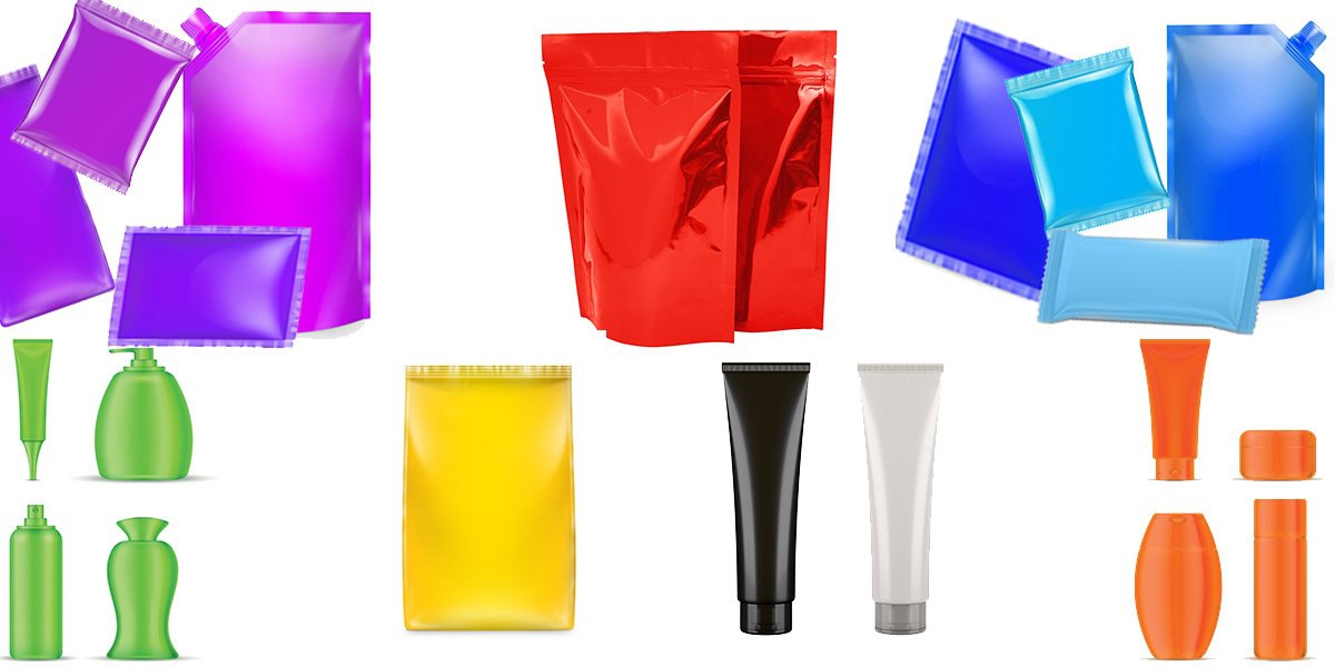
The color of your packaging, similar to shape, can speak to a target markets age, gender identity, nationality, and location. Here are some of the top colors and what they can imply for your product packaging if used strategically:
Black
The color black in a package design implies luxury and authority. Globally, black exemplifies a wide range emotions; from trust, authority or elegance to evil, and mourning. Align color selection with your product and its intended retail geography to have the greatest impact on sales.
White
White exudes simplicity and cleanliness. The clean and pure color (or lack there-of) allows for clear and concise messaging, and speaks to peace and calmness. White can also induce thoughts of creativity, likened to a white canvas with endless possibility.
Green
Green is often correlated with health, eco-friendliness, wellness, and money. Health is extremely important to many, and sustainability is becoming more and more prominent as a requirement for brands of all sizes. Use the color green to connect your product with the environment.
In some countries like Indonesia, however, the color green is actually forbidden. Be sure to check the significance of color in your global endeavors.
Yellow
Yellow is the most visible color in the color spectrum. When used as a main color in your packaging, yellow exudes excitement and positivity. Yellow is a good color to use in retail displays to draw a shopper in to your product. It also exemplifies happiness and light-heartedness in a product.
Purple
Purple invokes imagination in consumers. It also can express success and individuality. It is no longer gender-specific but still tends to garner more attention from females and children. It is a bold color that entices consumers to look further into your product.
Blue
Blue is the color of trust and reliability, and the different shades give even more depth of meaning. I mean, a majority of our planet, the place we call home is shaded in all of the blues, so this may lend itself as to why this is so!
Bolder blues represent a sense of significance for professional products. Lighter blues present more creativity and light-heartedness. Blue also contributes to calmness and security.
Orange
Finally, the color orange. Orange screams F-U-N! Several studies have found that orange, yellow and brown are correlated to inexpensive or affordable products, but these colors have also shown as the least favorite colors among adults. Children are most drawn to orange. It's also correlated with satisfying foods.
Use your packaging to speak to the world without saying a single word. Look into the size, shape, color and align these items with your target market and your products intended use to create a truly remarkable packaging design that will delight your ideal consumer.
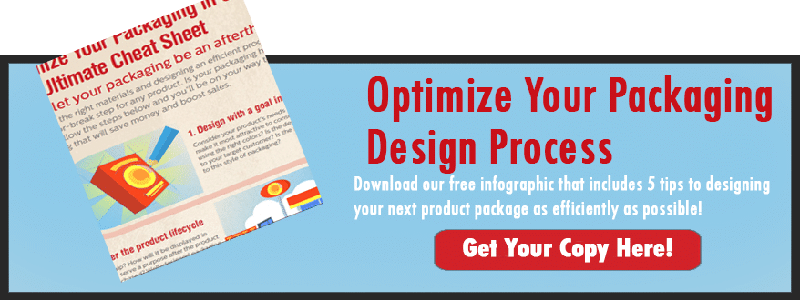
If you want to learn more about designing the ultimate package as efficiently as possible, check out our free cheat sheet on efficient packaging design!